The Blend Lounge was an immersive installation that The Blend US wanted to
use to bring to a physical space a series of articles they published online
about the ongoing history, current state and developing future of cocktails.
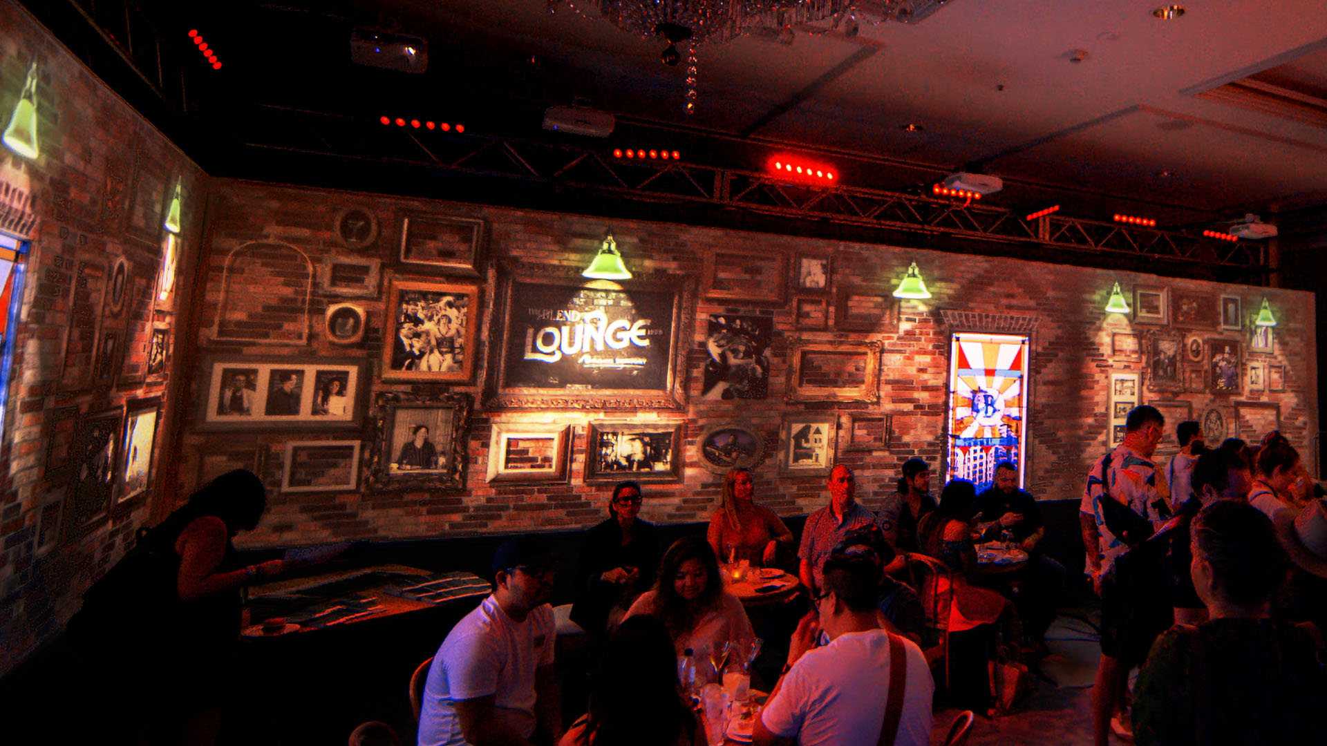
Imagined from the ground up, it featured indoor projection mapping to
create custom bar interiors representative of three different specific eras
in the annals of cocktail evolution.
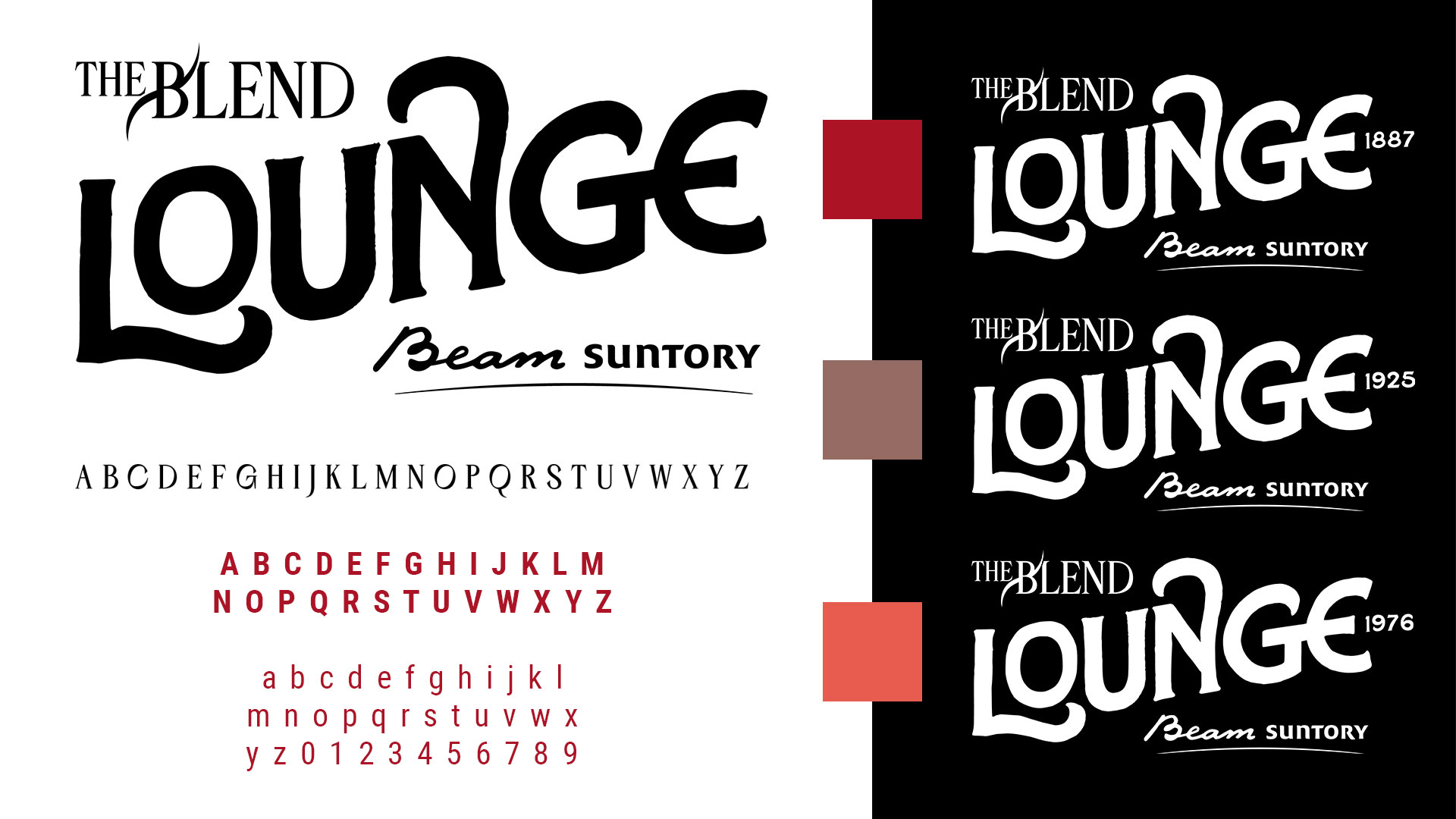
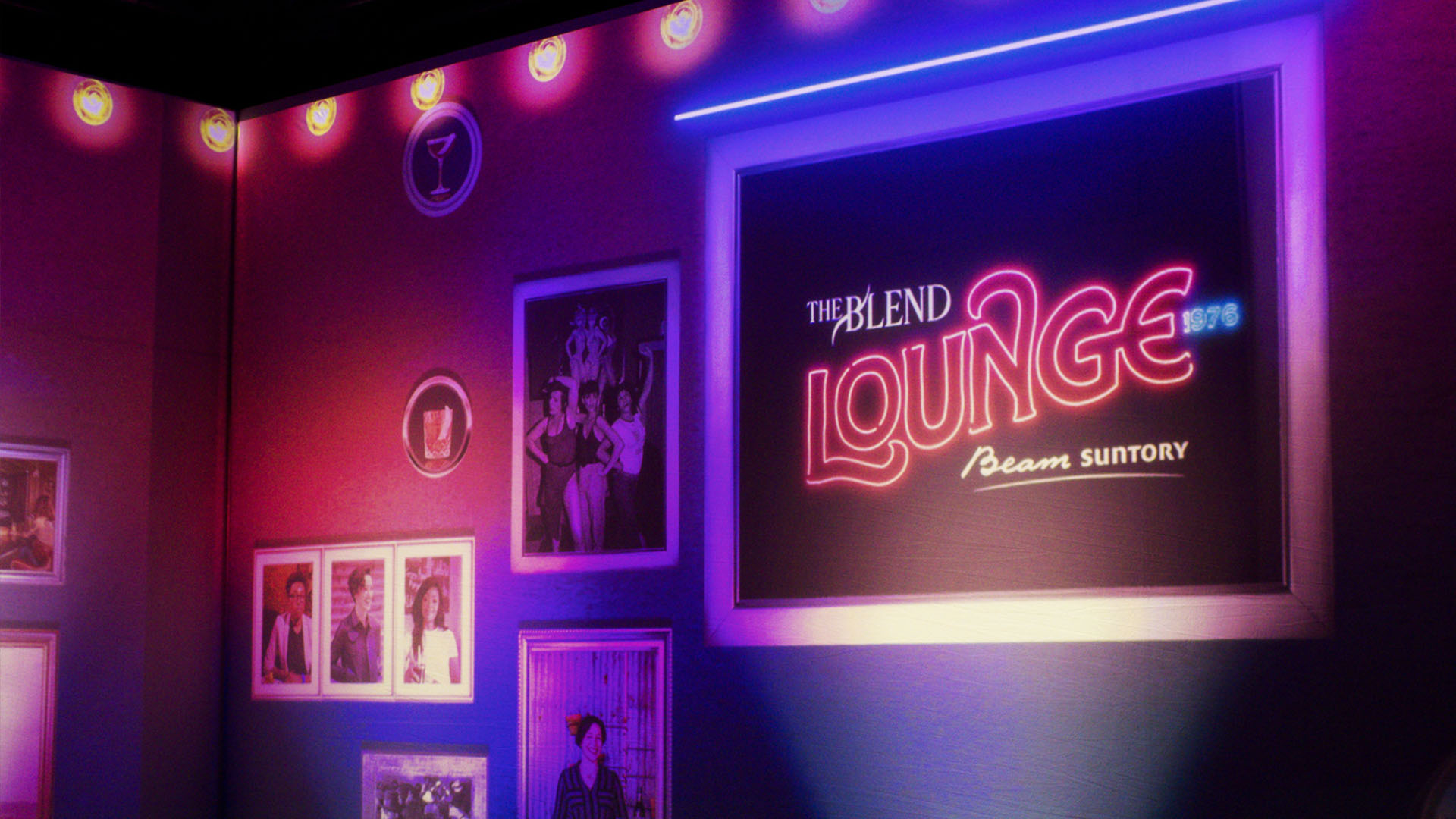
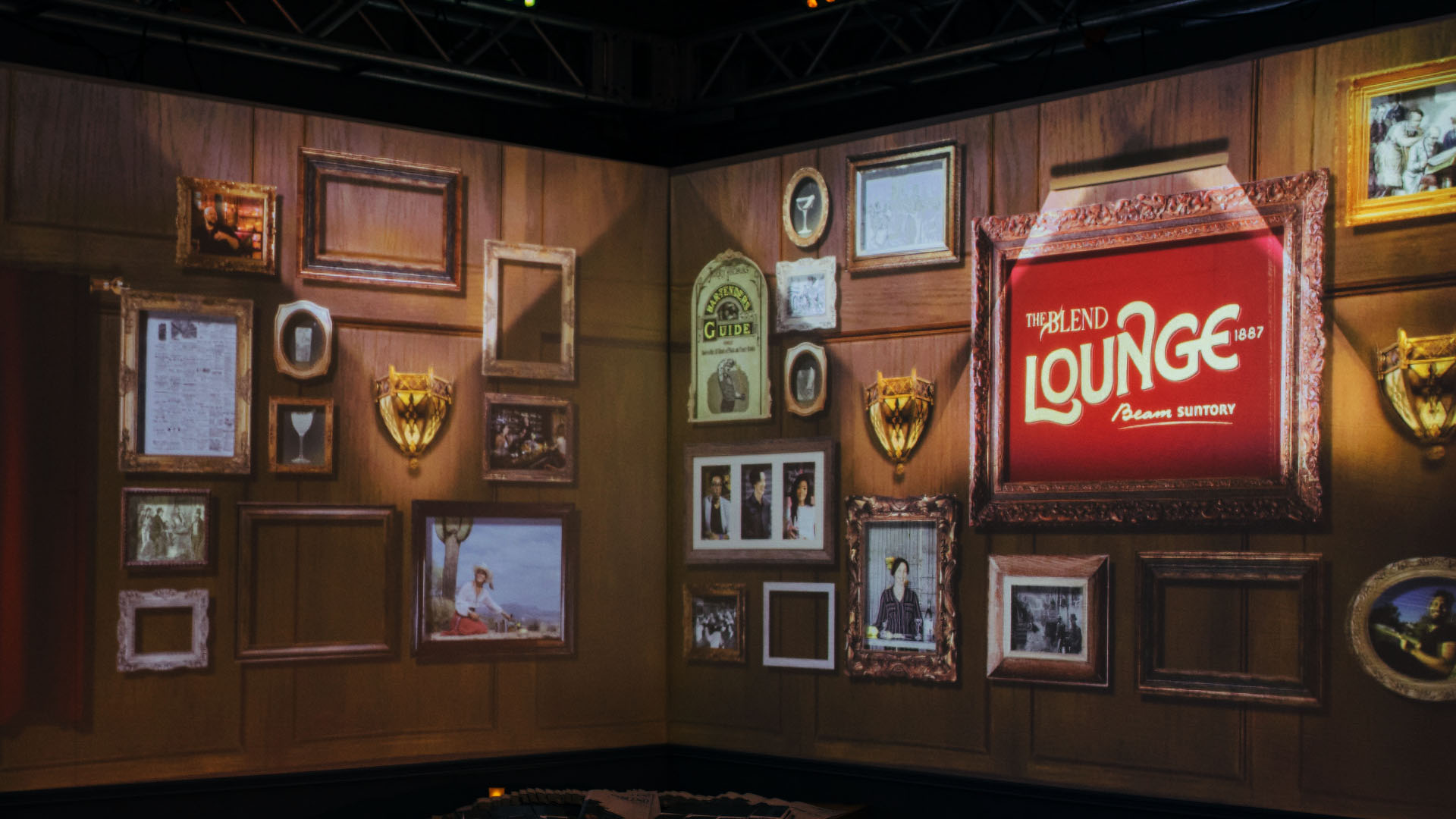
I developed a logo that could adapt to each of the three eras included in the exhibition, which were Gilded 1887, Speakeasy 1925, and Disco Studio 1976. I selected something suggesting a hand-painted lettering, as that was a strong commonality in signage of the selected time frames. I also made it simple enough to apply different era skins, depending on use. Another constraint was the requirement to work with fonts from The Blend's new global brand identity for most copy (type foundry Αtypical's Aegithalos, and Roboto Condensed). You will also see included here the individual color of red used for each year (1887 Velvet Curtain, 1925 Faded Brick, and 1976 Club Glow, respectfully).
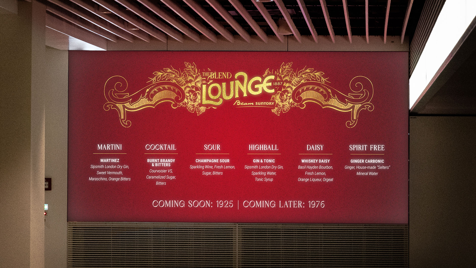

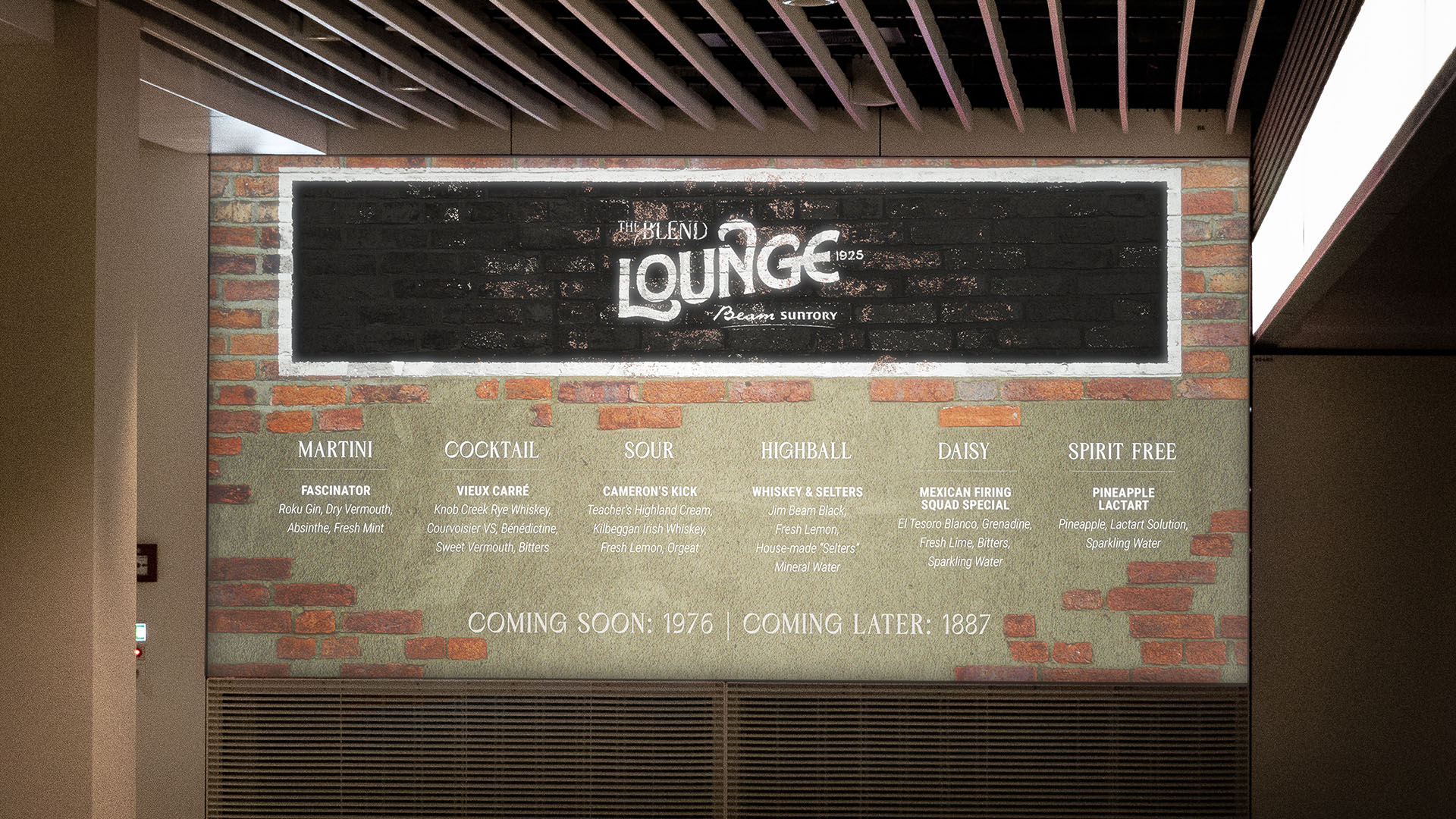
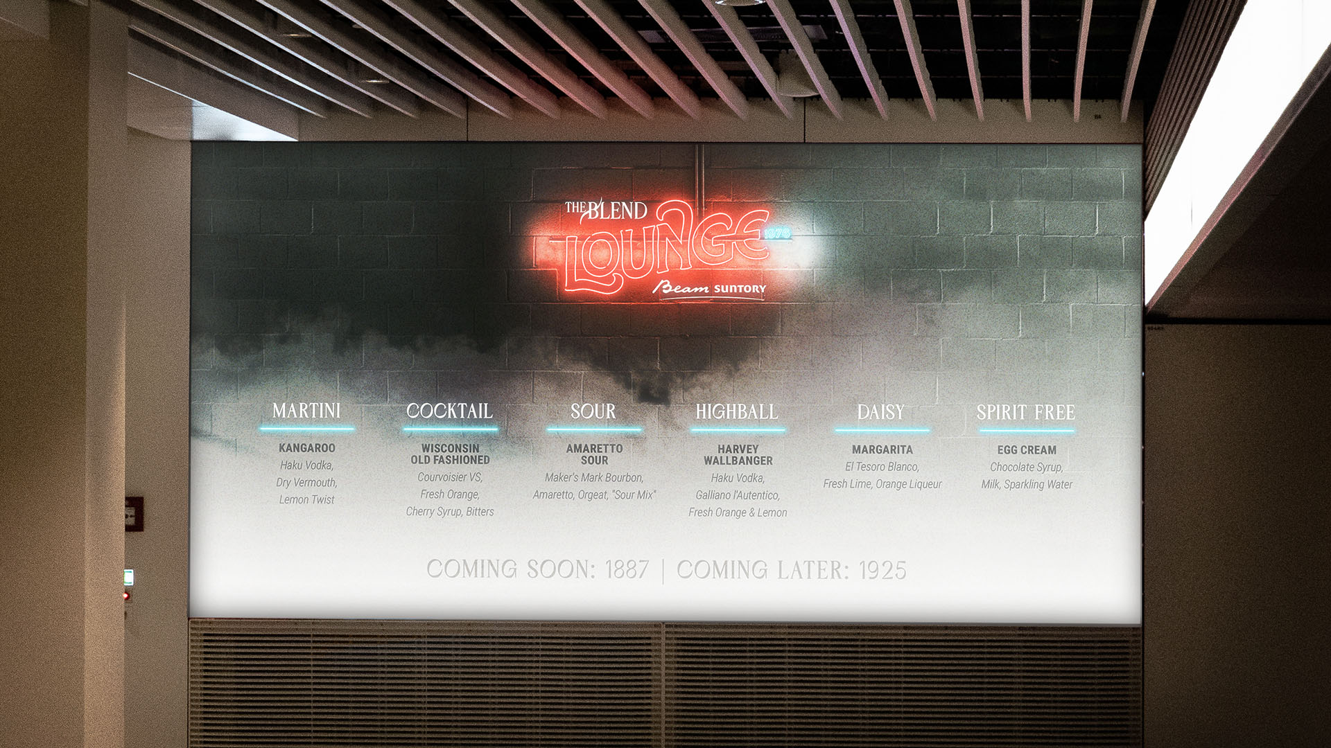
The set had a large screen to display the drink menu, which was skinned appropriately for each era. 1887 was a gilded lounge, Speakeasy 1925, and Disco Club 1976. The digital signage for the event was also similar to this application, and was used as a foundation for the projection design of the virtual interiors.
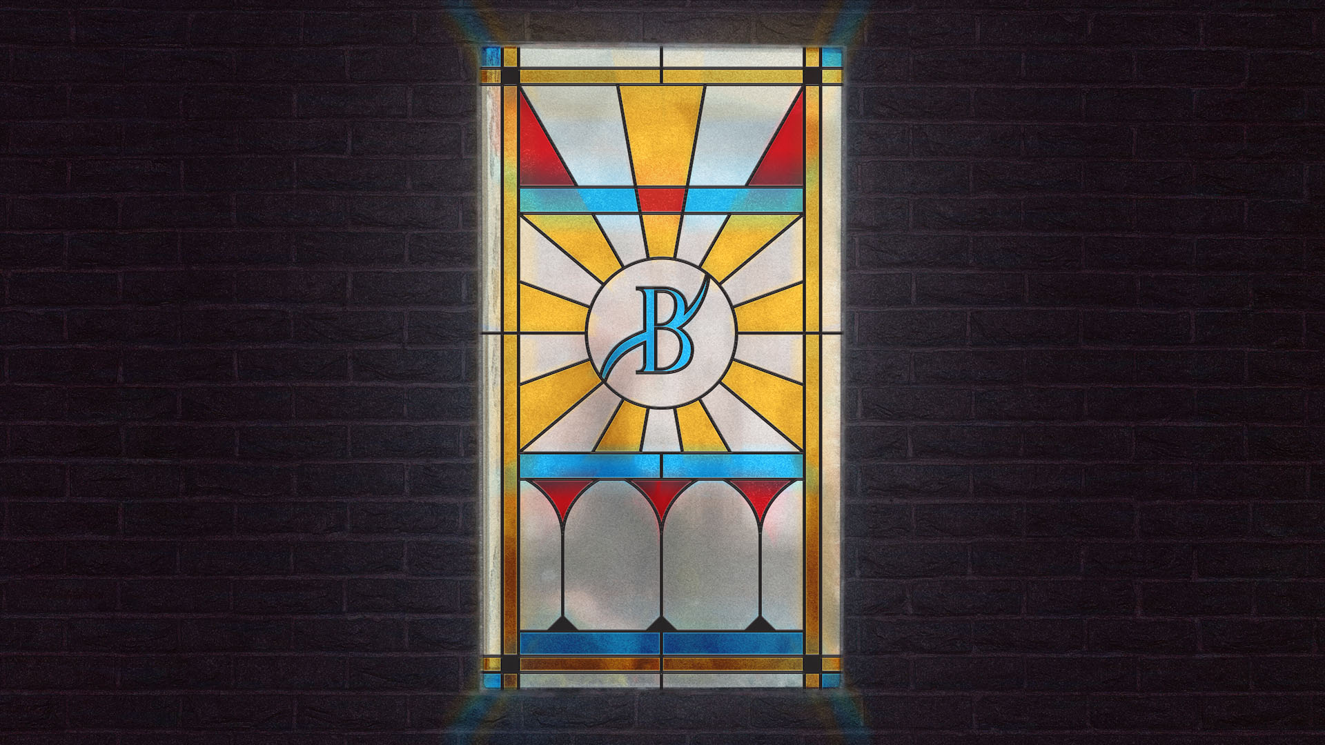
I also worked with the production company to develop the exhibition as a whole, and other design assets therein. The bar interior set had a fake window that required an image projection-mapped over it, so I designed a stained glass pattern featuring The Blend's logomark and cocktail glasses. Behind the window we had a screen with archival video footage of era-appropriate people walking about.
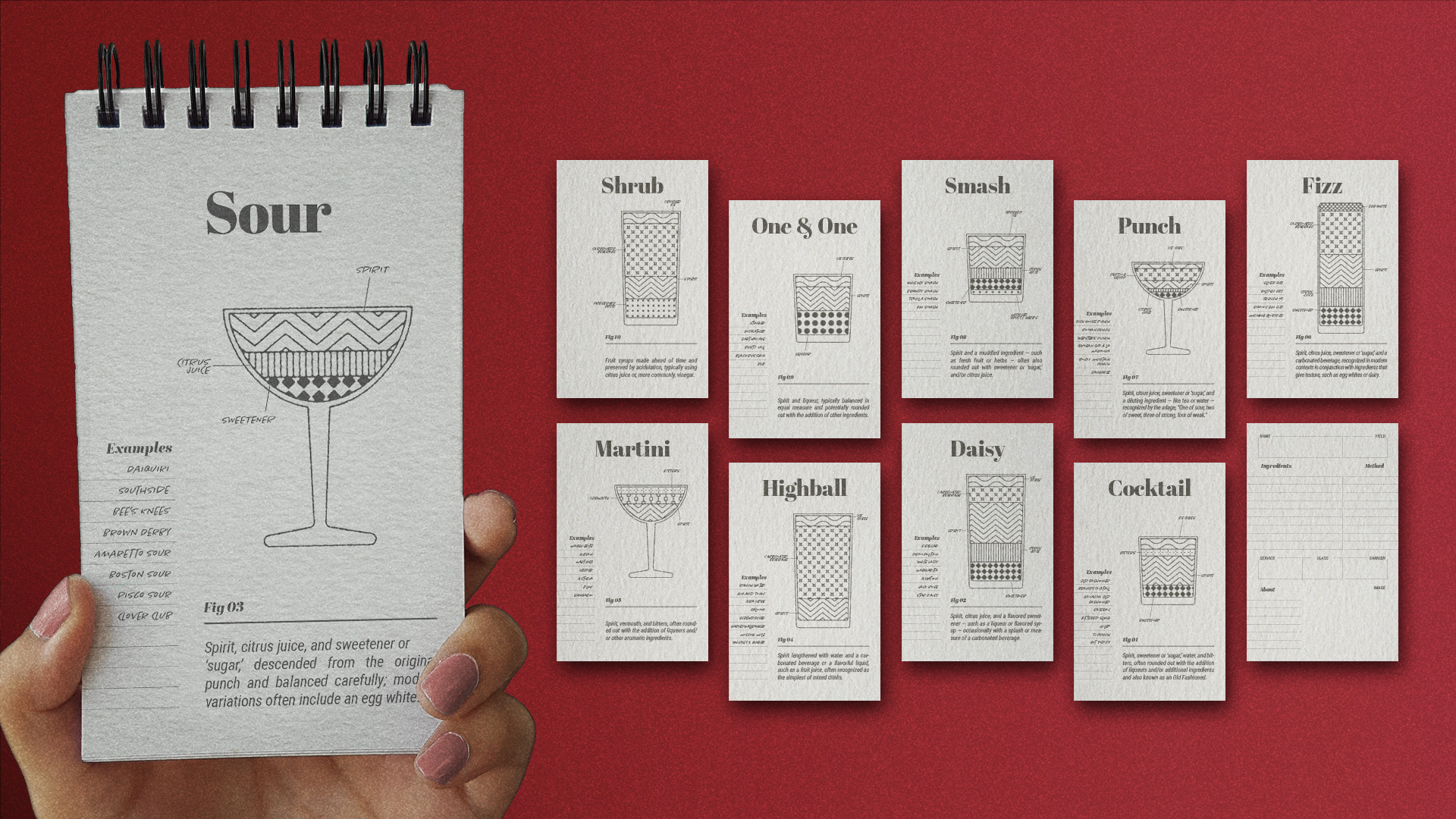
The articles that we represented in this morphing bar detailed the living history
aspect of cocktail development and what that means for the present and future.
Pulling from this, I designed a physical takeaway, as requested by the client,
creating a ‘field guide' notepad. The first section featured a small pattern
library of cocktail ingredients, used in cross-section diagrams to demonstate
the difference in classic drink categories and composition. The rest of the
notepad was filled with blank template pages so those coming away from the
exhibition could record their own creations to write the future of cocktails.
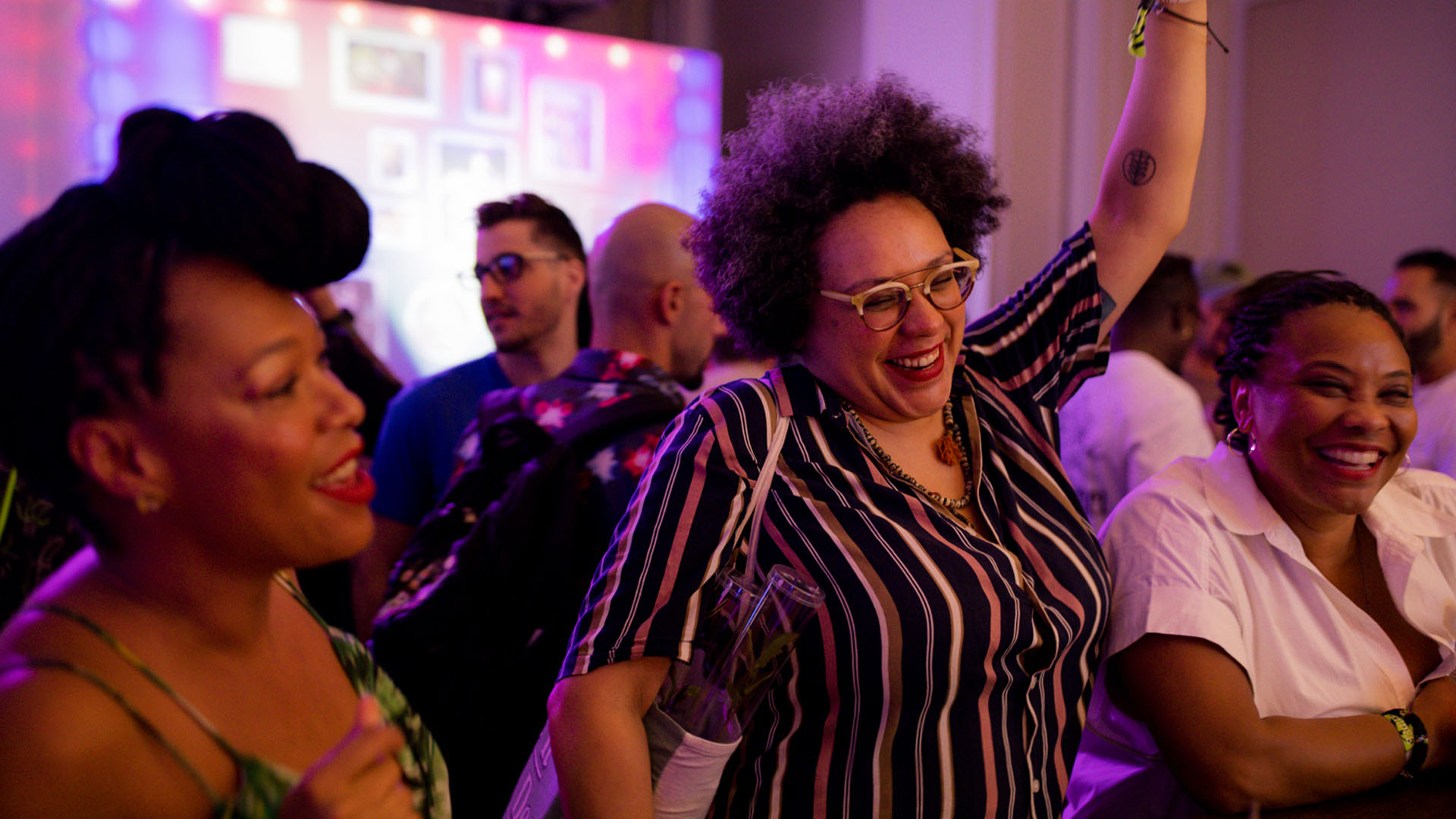
One of the main measures of success was site signups for and awareness of the client’s
growing website, a metric which the event overdelivered on
